

Agencja Wizerunku is becoming aw.je — and this is not a cosmetic refresh or a new layout for its own sake. The rebrand reflects who we have actually become: a partner that builds infrastructure, systems and sales alongside brand image, in Poland and internationally. The new name, logo and colours mirror three real growth directions. Here is what stands behind the change and what it means for clients working with us across the EU.
Why the Agencja Wizerunku rebrand is happening now
The rebrand answers a simple fact: the company outgrew the definition contained in its name. “Agencja Wizerunku” means “image agency” in Polish, and it described our starting point well — building brand image. Over recent years the scope of our work has expanded far beyond that word, and the name started narrowing how clients saw us. Three concrete growth directions drove the decision, and we describe each below.
Rebranding for international expansion — a name that travels
A growing share of our work is international: market-entry strategies, servicing foreign clients and communication in multiple languages. A long Polish name is hard to use in international business, especially across multilingual EU markets. We needed a brand that works equally well in Warsaw and in a call with a client abroad. aw.je is short, pronounceable and memorable in any language.
From image to infrastructure and sales — a wider scope of work
Image-building used to be the core; today we build entire business back-ends for clients. We deliver websites and landing pages, platforms, systems and AI-based tools that support sales and conversion. We are also doubling down on outsourcing — becoming a real operational back office for our clients, not just a creative supplier. This is no longer an “image agency”; it is a technology and marketing partner.
New industries beyond agriculture — sport, e-commerce and specialised sectors
We grew from a strong position in agriculture, but that is now only part of our work. We are expanding into further sectors — from sports clubs, through e-commerce, to other specialised areas. Each industry demands its own language and competences. The new brand gives us room to be credible in every one of them.
The new name aw.je — what it means and where it comes from
aw.je connects where we come from with where we are going: “aw” is our heritage, “.je” signals the future. The name is short, modern and deliberately stripped of unnecessary words — because that is also how we work. Substance over ornament. The dot in the middle is a focal point: the place where heritage meets technology. There is one more layer: aw.je is pronounced like “aww yeah!” — a spontaneous shout of enthusiasm and agreement. That association is the foundation of the brand's communication: positive energy and a clear “yes” for the client.
“aw” in aw.je — Agencja Wizerunku roots reduced to their essence
aw stands for the initials of Agencja Wizerunku — we are not erasing our history, we are condensing it. It is the same quality and the same team, in a more mature form. The abbreviation preserves brand continuity for clients who have known us for years.
“.je” in aw.je — a domain-style ending as a signal of the future
.je says it plainly: we are digitally native and ready for international markets. The brand was conceived as online-first, global and easy to remember. A short, domain-style ending works like an address — the company name and the website address are one and the same.
The new aw.je logo — minimalism, lowercase and scalability
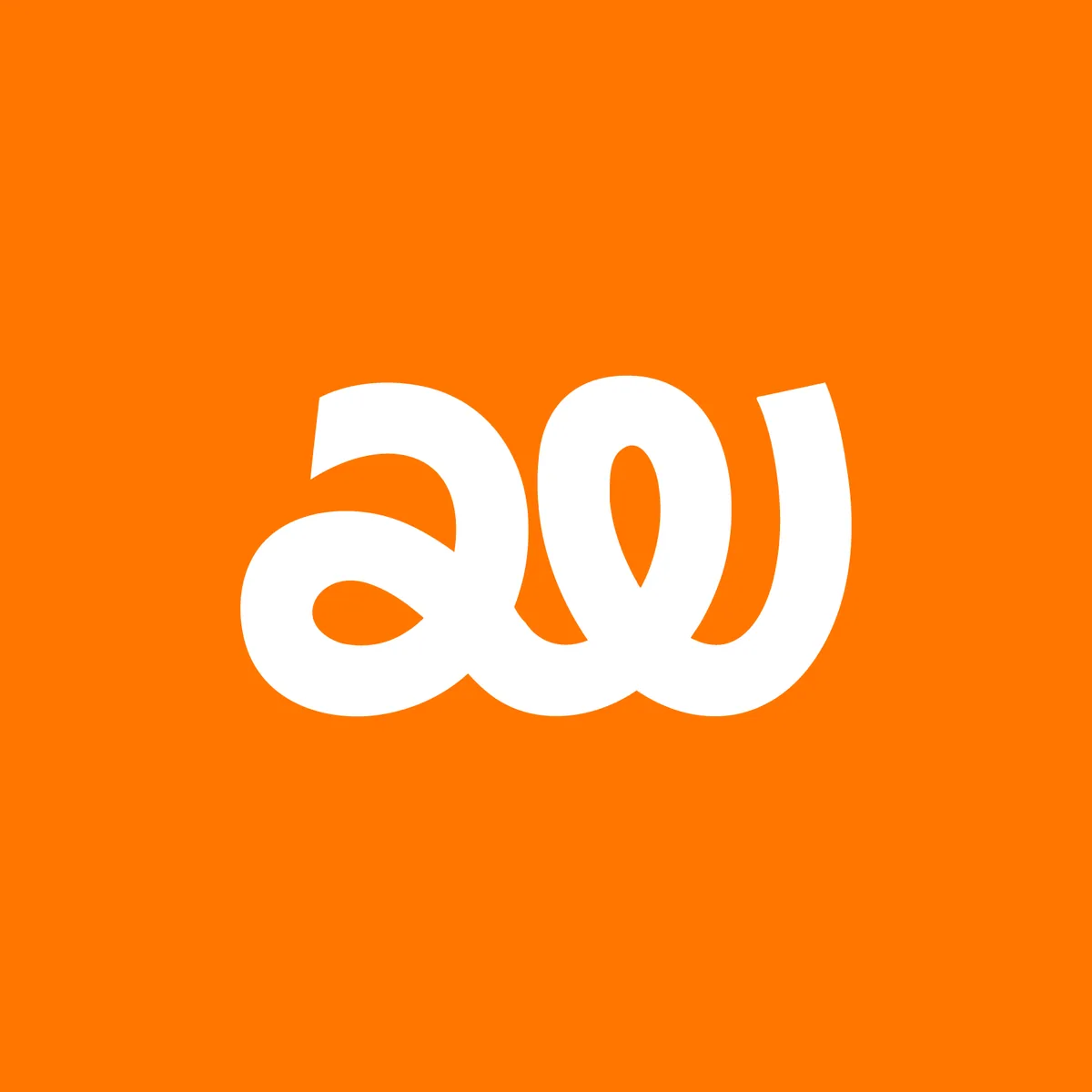
The new mark is minimalist and digital in spirit — the fewer the ornaments, the stronger the name and colours resonate. The logo was designed for a brand that operates digitally and internationally, so it has to perform everywhere. Two deliberate design decisions define it: the lowercase spelling and full scalability of the mark.
Why the aw.je logo is written in lowercase
Lowercase is a conscious decision about accessibility and closeness. Capital letters build distance and corporate gravity — we want to be the partner you talk to across the same side of the table. Lowercase says: we are modern, open and focused on the work, not the pose.
Logo scalability — from app icon to billboard
The logo is simple, legible and scalable — it works equally well as an app icon, an email footer, a t-shirt print and a large banner. That is a requirement, not an accident, for a brand present on every medium and at every size. The form is deliberately economical so the mark stays legible even at the smallest scale.
Your brand is what other people say about you when you're not in the room.
The aw.je brand colours — what navy and orange symbolise
The aw.je identity rests on two colours: deep navy and energetic orange. Navy says “we are a solid technology partner you can trust”, and orange adds “and we do it with energy, creativity and a focus on results”. Reason and emotion, foundation and motion, technology and people — that combination is exactly what aw.je is becoming.
Digital Navy (#040084) — the navy foundation of technology and trust
Digital Navy (#040084) stands for depth, competence and trust — the colour of technology, stability and professionalism. We call it “Digital” on purpose: it is not heavy corporate navy but a digital depth for a brand that thinks in technology and data. Navy is the solid base — the thing you can rely on.
Vibrant Orange “Xona” (#FD6600) — the orange energy of action
Vibrant Orange “Xona” (#FD6600) stands for action, creativity and courage. It is the colour that draws the eye, stirs emotion and pushes to act — exactly what we do in campaigns, sales and creative work. Orange is our human, warm side: team energy, bold ideas and a focus on concrete results rather than art for art's sake.
What the aw.je rebrand means for clients — and what stays the same
For clients the change means one thing: a partner with broader competences and bigger ambitions — with no disruption to ongoing work. We are changing the name, logo and colours, but not what matters most. The rebrand is not a break with the past; it is its more mature, next-stage version.
What does not change after the rebrand — team, quality and values
The same team, the same quality and the same values stay. So does substance over fluff, a partnership approach and treating the client's business as our own. All ongoing projects and agreements remain in force without change.
What clients gain from the change to aw.je
Clients gain a partner that delivers technology, infrastructure and sales support alongside brand image — at home and across international markets. Add to that experience in successive industries: from agriculture, through sports clubs, to e-commerce. The aw.je brand was designed to grow together with us and with you. This is only the beginning of a new chapter — aw.je: from image to results.
Thank you for being with us. The best is ahead.